Thursday, December 17, 2009

Week 6- Beginning our Watercolor Landscape Paintings

Last week, we talked about the different ways we could manipulate watercolors by trying a flat wash, graded wash, wet on wet and dry brush techniques on a practice strip of paper. This week we began to lay in the background of our watercolor landscapes. We talked about taking our time and layering colors.


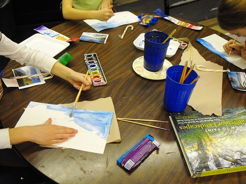
I told the kids that watercolor is different from oils and acrylics, because it's hard to change or go over a color if you aren't happy with it. You sort of get what you put down with watercolor and that's why it's a good idea to take your time and think about where you are putting color and how much color you are putting down.


Also, unlike oils and acrylics which are opaque paints, watercolors are translucent. In other words, if you want white in your painting that means not painting on that part of the painting, as the paper is your "white", as you can see through the paint to the paper below.

The same goes for lighter colors like yellow. If you are painting a green field and there's a bit of yellow in there, it's best to leave the yellow part blank, paint the green, and then go back in and paint the yellow part. If you just paint green and then try to paint yellow over it, you won't end up with a light bright yellow.


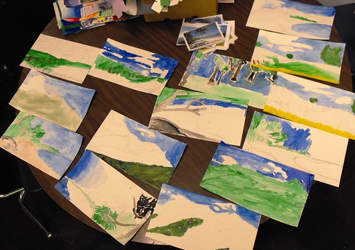
Watercolor is challenging and requires some forethought, but the kids seems to be doing a good job of figuring this out.

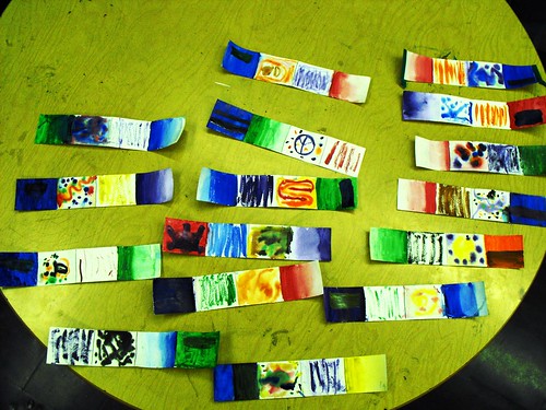
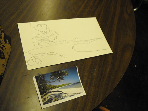
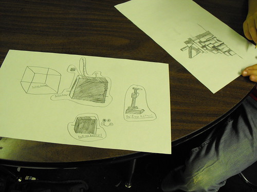
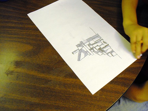
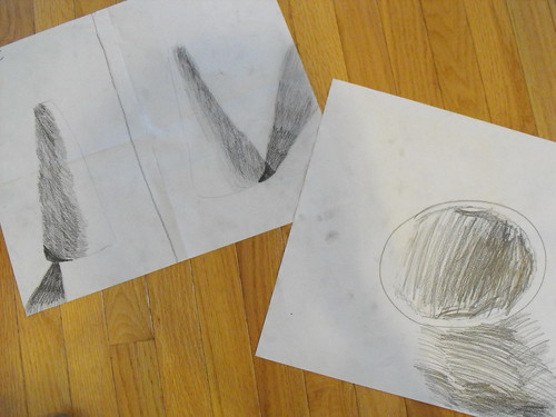
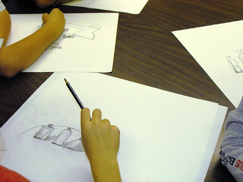
Here's their progress so far:


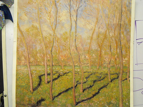
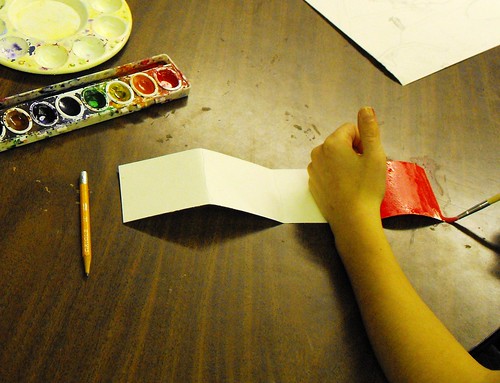
We'll continue to lay in the backgrounds of our landscapes when we meet again after the break. The following week we'll talk about how to paint the more detailed parts of the foreground in our landscapes.

Have a great holiday break and we'll see you in 2010!!

Tuesday, December 8, 2009

Week 5- Exploring Watercolor Techniques

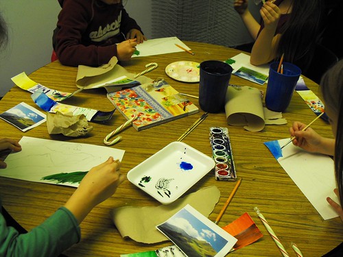
This week, we explored 5 different watercolor techniques.

The first one we tried was a flat wash. Basically, it involves loading the brush with water and paint, making broad strokes back and forth to lay in an even tone of color. This is useful when painting a background or large solid area.


Then, we did a graded wash. This is useful for laying in skies or water to show depth.

Then, we did a wet on wet technique. We used our brushes to saturate the paper and then made strokes of color on top to see what happens. Using more than one color makes those colors bleed together. I think this was the kids' favorite, because it you end up with such a unique results. Wet on wet is a technique that is truly "watercolor-esque" and can't really be duplicated in oils or acrylics.

Next, we did a dry brush technique. This is used to lay in broad saturated strokes of color.

Finally, we layered some color over part of our flat wash. We talked about how layering color is a way to mix colors right on the paper. The transparency of watercolor lends itself to layering.

Next week, we'll start on our landscape using the techniques we went over today. Here's all the techniques, in a row:


By the way, I'm trying to collect white (black doesn't work... can't see the colors well) styrofoam containers for paint mixing.

I'm looking for the smaller ones... around 5 1/2" x 8". Please send them in with your kids if you can. Thanks!

Tuesday, December 1, 2009

Week 4-Starting our Watercolor Landscape

This week, we started a long term watercolor project. I gave each student a photograph of a landscape. There are four scenes...beach, mountains, a field and forest. We talked about the horizon line and composition.


Then, we started to sketch our landscape drawings, being careful not to press too hard. Sketching the forms lightly will ensure that we won't see the pencil lines when we paint.


Some of the kids had forest scenes are were concerned about drawing each leaf on the trees. I told them they don't have to do that. Many artists draw and paint trees to suggest leaf forms without drawing each individual leaf. Here's a forest landscape by Monet. Even though the painting is done in oils, the same idea applies:


Leaves are suggested with color and form. We'll do the mountains and beach the same way. The prior three weeks were a good foundation for this landscape drawing. The kids have concentrated on geometric shapes and now they are working on organic shapes.

Here's an example of the mountain scene:


And here's the beach scene:


Next week, we'll cover the four basic watercolor techniques: Flat Wash, Graded Wash, Wet on Wet, and Dry Brush in the beginning of the class. Then, we'll start on our painting.

Thursday, November 26, 2009

Week 3-Shading a cube and more complex structures

This week, we covered drawing and shading a cube. Mrs. Luker showed the class how to draw a basic cube shape step by step:


We talked about how the flat side closest to the light would be lightest, as it is reflecting the most light from the lamp. The other sides would be a bit darker and the side facing away from the light source is the darkest of all. We talked about shading to show light and dark and volume being careful not to scribble to shade or press too hard with the pencil, which would make your drawing look like you were shading a black or dark gray cube.

Some kids were looking at the cube in a silhouette-like manner because the cube was in front of the light. In this case, their cube does end up looking dark gray because the side in shadow is facing them.


Then I had the class put together a structure with simple wooden blocks to draw from. They could choose to focus on part of the structure that interested them most.


Next week, we will start a watercolor landscape. During the first class we will draw from a photograph using the skills we have learned in the first three weeks. During the following weeks we will cover some watercolor techniques and eventually paint our landscape drawing.

Wednesday, November 18, 2009

Week 2- Shading Light and Dark

This week we focused on shading light and dark with simple objects. I forgot my camera this week so I took the following photo at home:


First I set the ball up with a light source just like last week's still life. I talked about how light travels over the round object. The sphere is lightest closest to the light source and darkest further away. However, there's also back-lighting and the very edge of the ball furthest away from the light source. In some cases back-lighting is more apparent and it all depends on your vantage point. I switched the light source to the opposite side so that the kids would have a different vantage point. Same object, different shading with light and dark.

Then, I set up the cone and talked about how light hits that object. We did the same exercise shading light and dark with the cone and I also switched the light source so that they could do it again from a different vantage point.

The point of this exercise, is to understand how light affects solid objects. As an artist, you are hoping to show that the object is 3 dimensional and has volume on your 2 dimensional piece of paper.


I could tell that some of the kids were getting a little bored with the exercises and that's understandable. I explained that by doing shading light and dark on these simple objects, it will help them show light and dark on more complex objects in future drawings. Drawing exercises like this are like practice with sports. You don't play games without practice....at least not well. It's the same thing with art. These lessons are the foundation of good drawing skills.

And as an artist, it's your job to find beauty in the mundane. Any object can be interesting if you look hard enough. :)

Next time we'll work on shading a cube and I'll also bring more complex objects. After Thanksgiving break, I hope to introduce color theory with watercolors.

Tuesday, November 10, 2009

Our First Day- Simple Still Life

Since this was our first class together, I thought it would be best to start with some basic drawing skills and set up a still life for the students to draw from. The still life consisted of 4 glass bottles with one light source.


We talked about the size and shape of the objects and how they relate to each other. We went over how to measure and gauge the distance between objects and how the flat sided bottles differ from the round cylindrical bottle shapes. We also talked about foreground, mid-ground and background and how to draw objects that in a way that tells the viewer where the objects are in space.

I briefly went over negative space and how it relates to positive space and how it helps you draw objects. In our still life, the bottles are the positive space and the space around them is the negative space.

Here's some of the students work:


Next week we'll go over shading with light and dark with a light source and another simple still life.

In the future we'll do some projects, including watercolor, painting with either acrylic or oil on canvas, and also sculpture. We'll probably tackle some of these larger projects over the course of a few weeks after the first of the year. Between now and then we'll cover the basics of drawing, light and dark, and maybe introduce some color theory.